
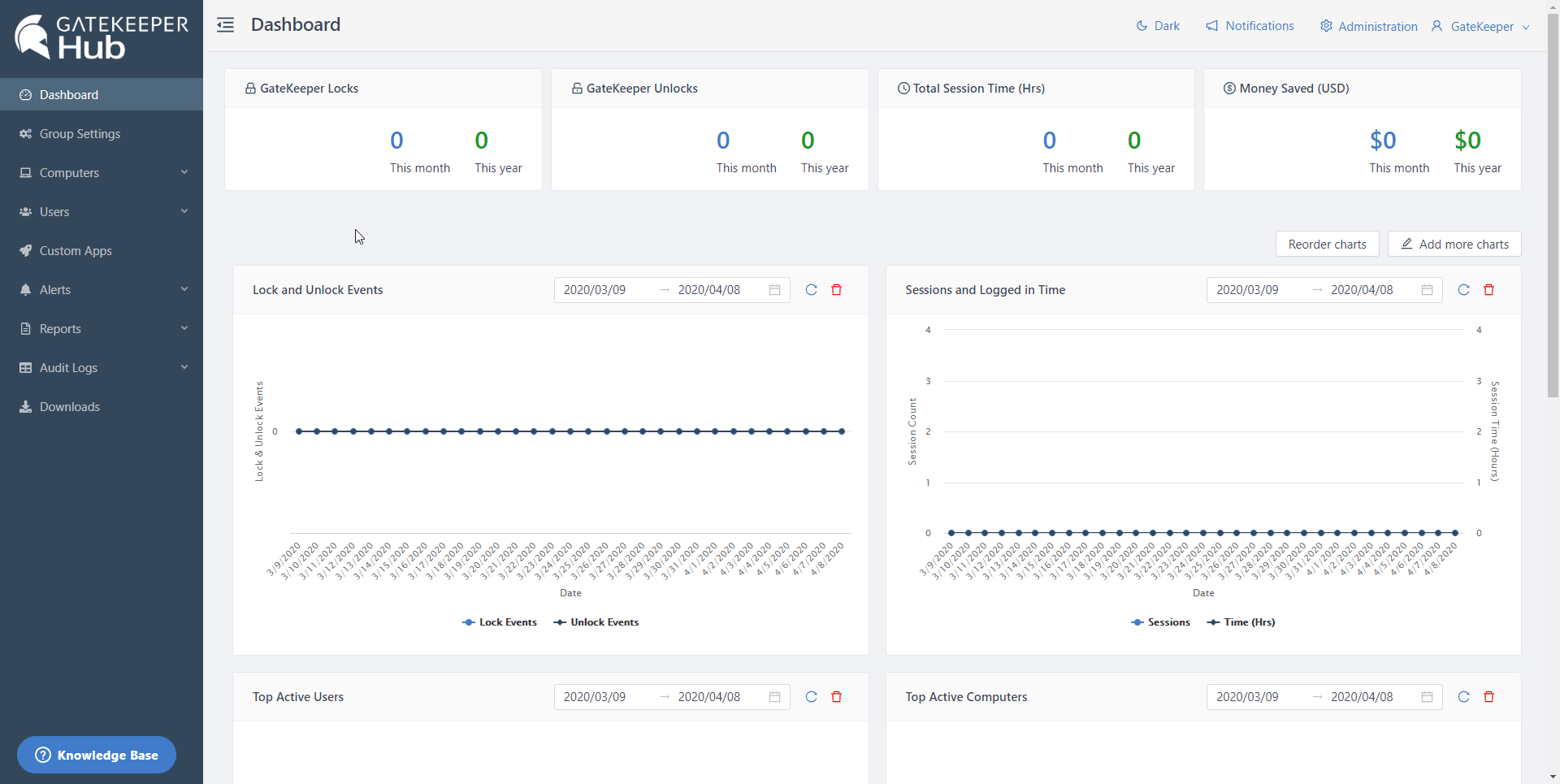
GateKeeper Hub dashboard shows statistics and data visualization elements based on your organization's GateKeeper System's usage.
Currently, you can customize the following:
1. Add more charts
By default, GateKeeper dashboard shows multiple metrics.
- Lock and Unlock Events
- Sessions and Logged in Time
- Most Active Users
- Most Active Computers
- Overall Password Strength
You can also add any of the following charts to your dashboard by clicking Add more charts and clicking + Add to Dashboard in the opened drawer.
- User Information
- Token Information
- Computer Information
- Active Directory Accounts
- Number of Sessions Heat Map
- Logged in Time Heat Map

2. Reorder Charts
Charts on the dashboard are arranged into two columns. Once you added all the charts you want to see on the dashboard, click Reorder charts.
You can drag and move the charts either in the same column or across the column.
If you have any further questions, IT problems that need to be addressed, or compliance problems that need to be solved, please visit www.gkaccess.com or contact us at info@gkaccess.com or (240) 547-5446 to see how GateKeeper Enterprise can automate digital security for your end-users and admins.
-------------------------------
GateKeeper dashboard; customize GateKeeper dashboard; add charts to GateKeeper dashboard; re-arrange dashboard charts; add to dashboard; edit dashboard; edit admin console graphs; change graphs; update graphs in Hub; new graphs in Hub; latest graphs in GateKeeper Hub; GateKeeper metrics; updating dashboard in GateKeeper; admin dashboard; how to change charts; add another chart; switch charts; remove charts; where are the charts; how to restore charts; how to restore a chart; how to get a chart back; repost chart; repost graph; where did the graph go?;
Comments
0 comments
Please sign in to leave a comment.